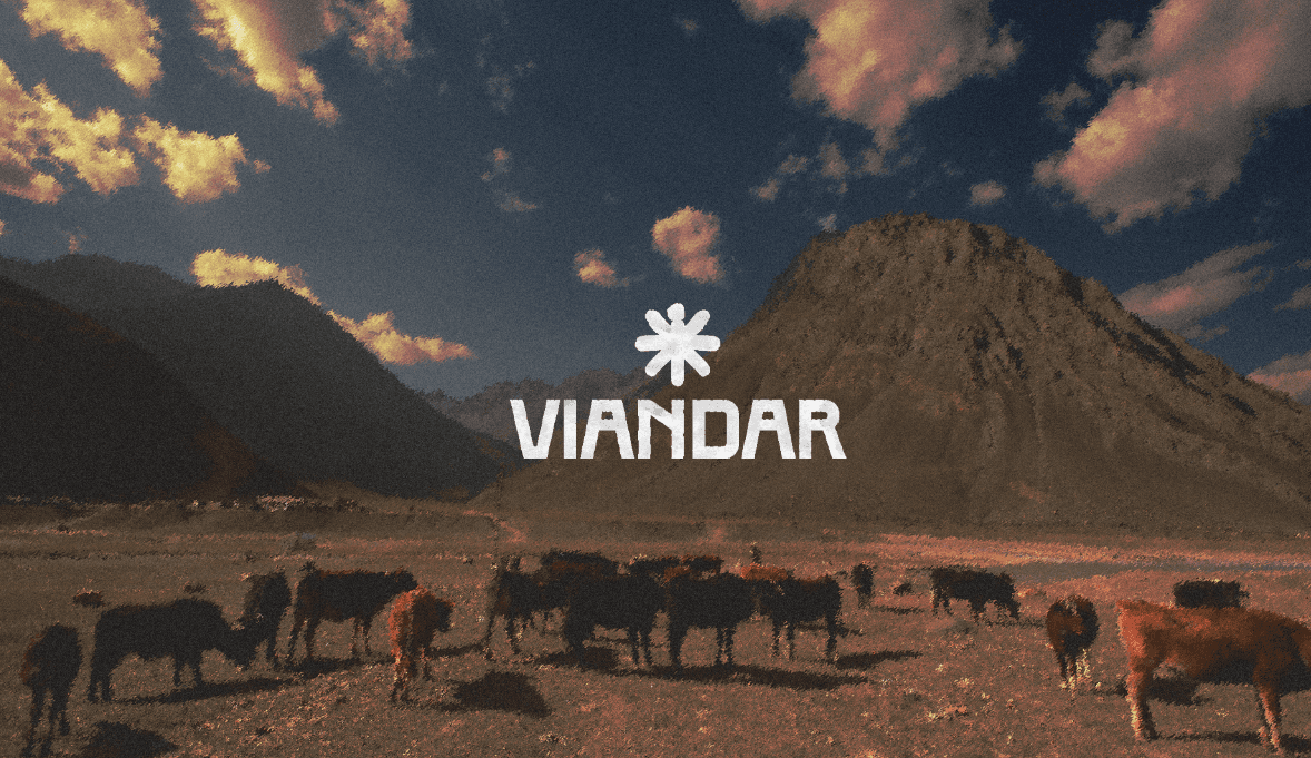
VIANDAR
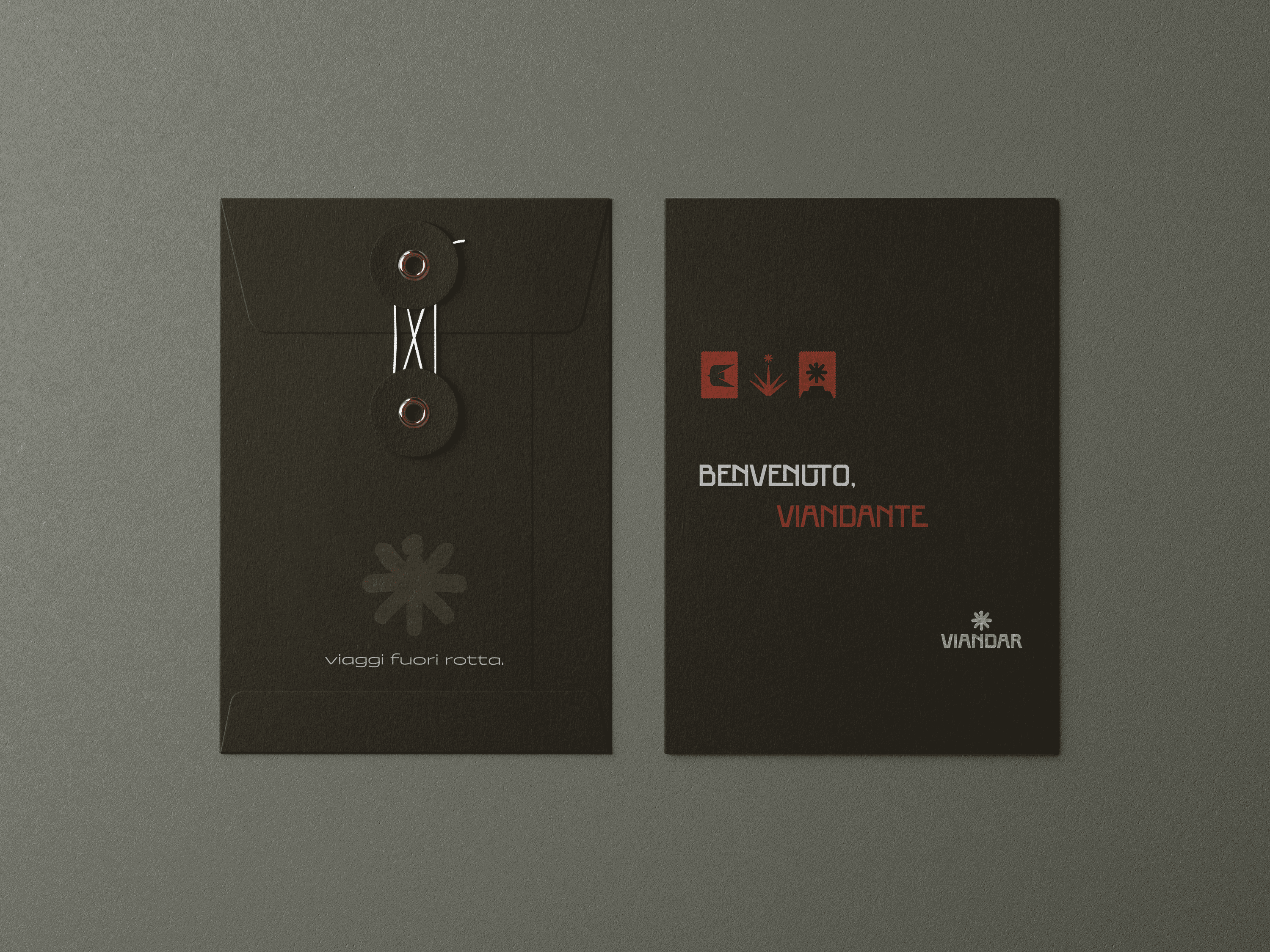
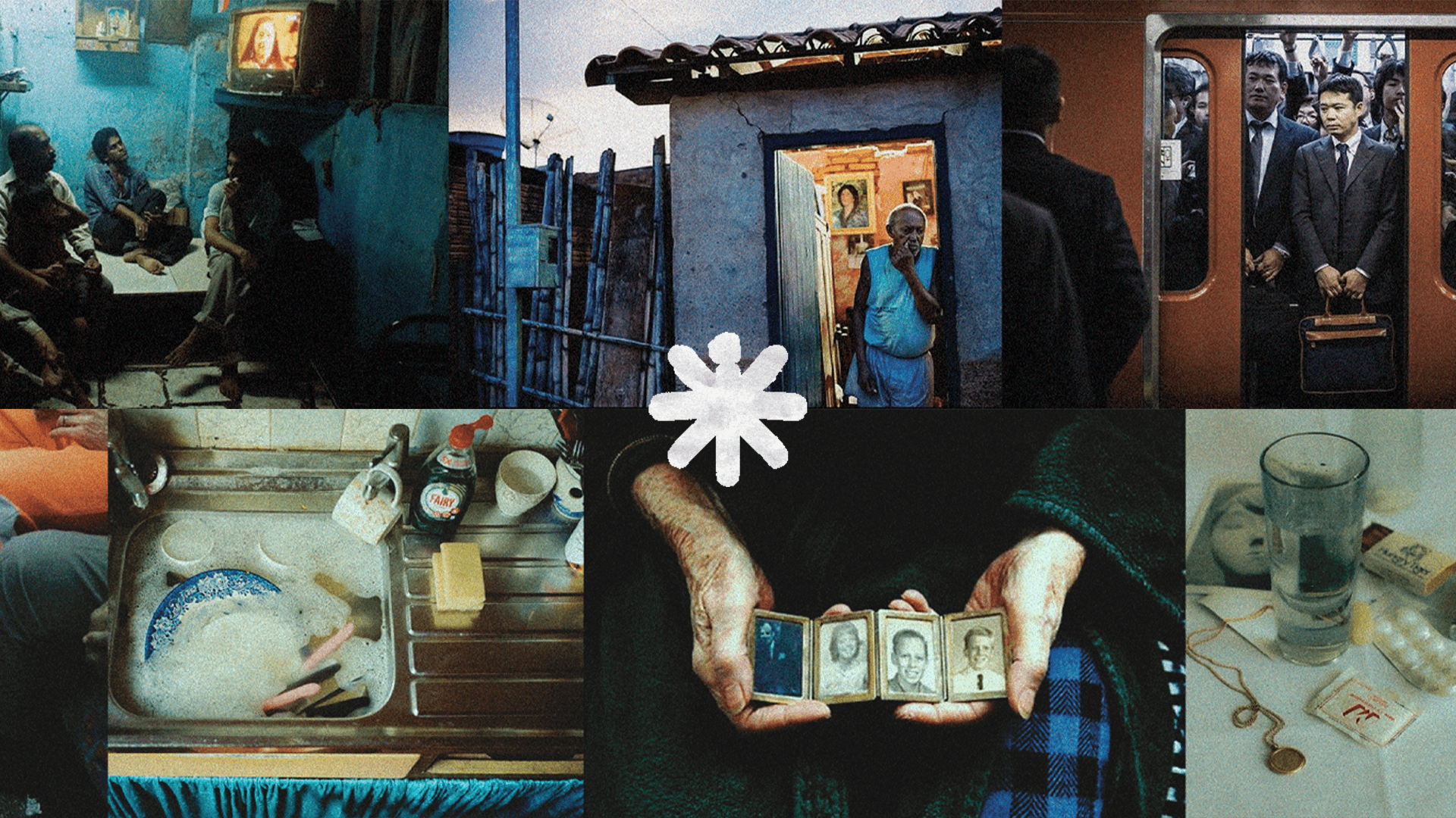
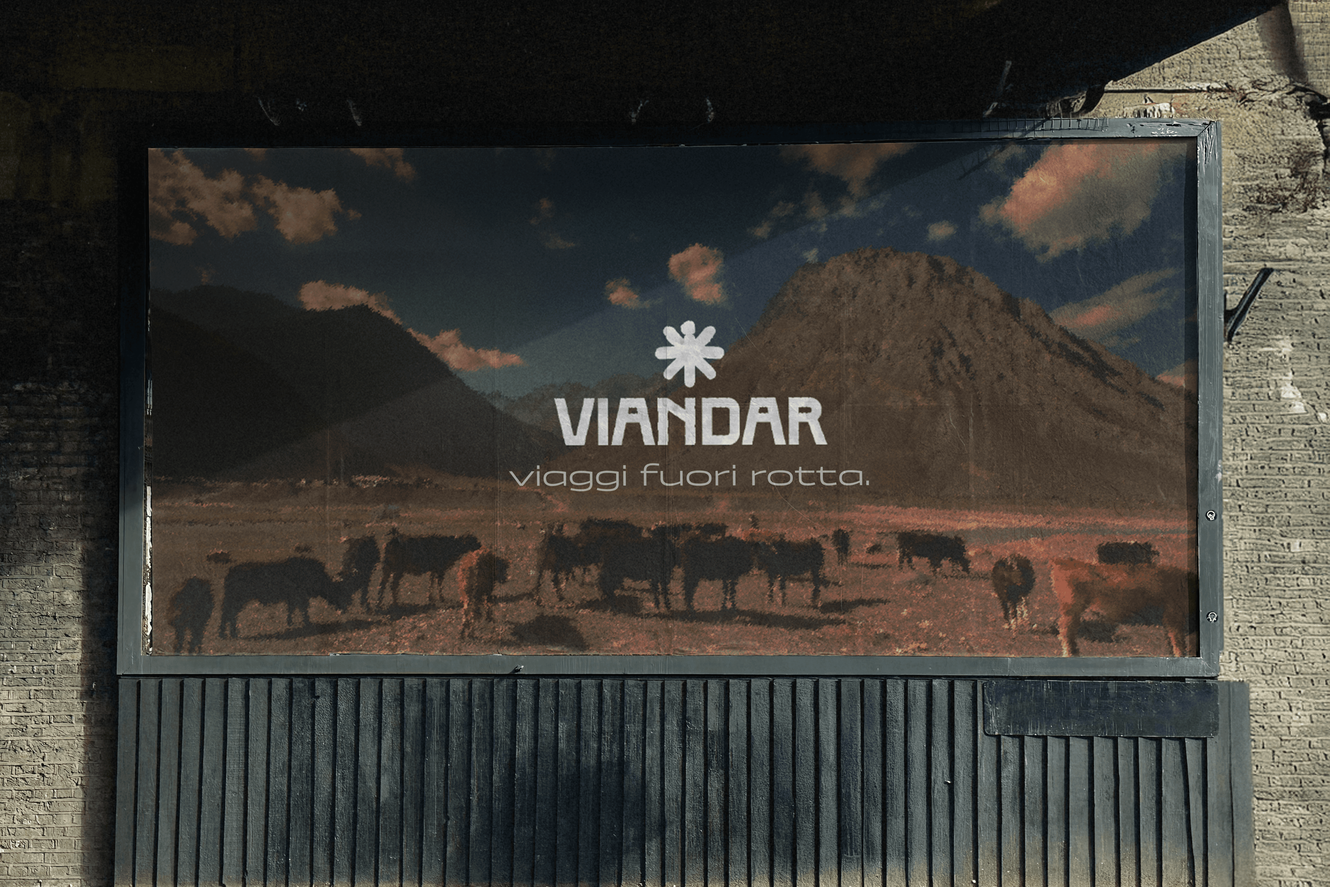
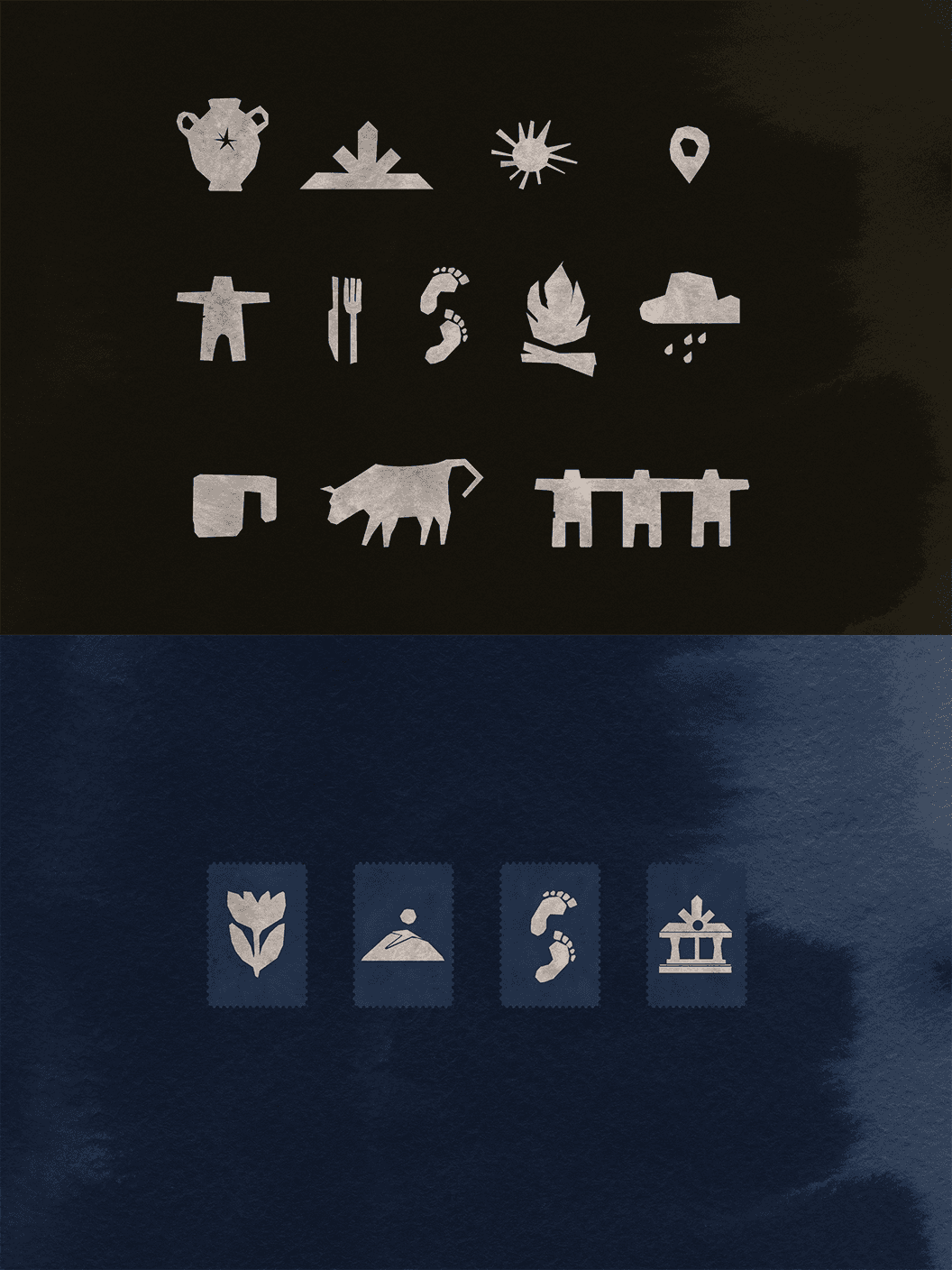
Viandar was developed as a travel identity built around storytelling, human connection, and the experience of places through the five senses. Rather than relying on a polished or overly conventional travel aesthetic, the project aimed to create a more tactile, emotional, and recognisable visual language.
Year
2025
Scope
Brand Identity
Client
Dive talent agency & Viandar
Duration
2.5 months
Challenge
The challenge was to create an identity that could stand apart from generic travel visuals and communicate a more human idea of travel. It needed to feel flexible across different destinations and cultures, while maintaining a distinctive character shaped by atmosphere, texture, and narrative.
Solution
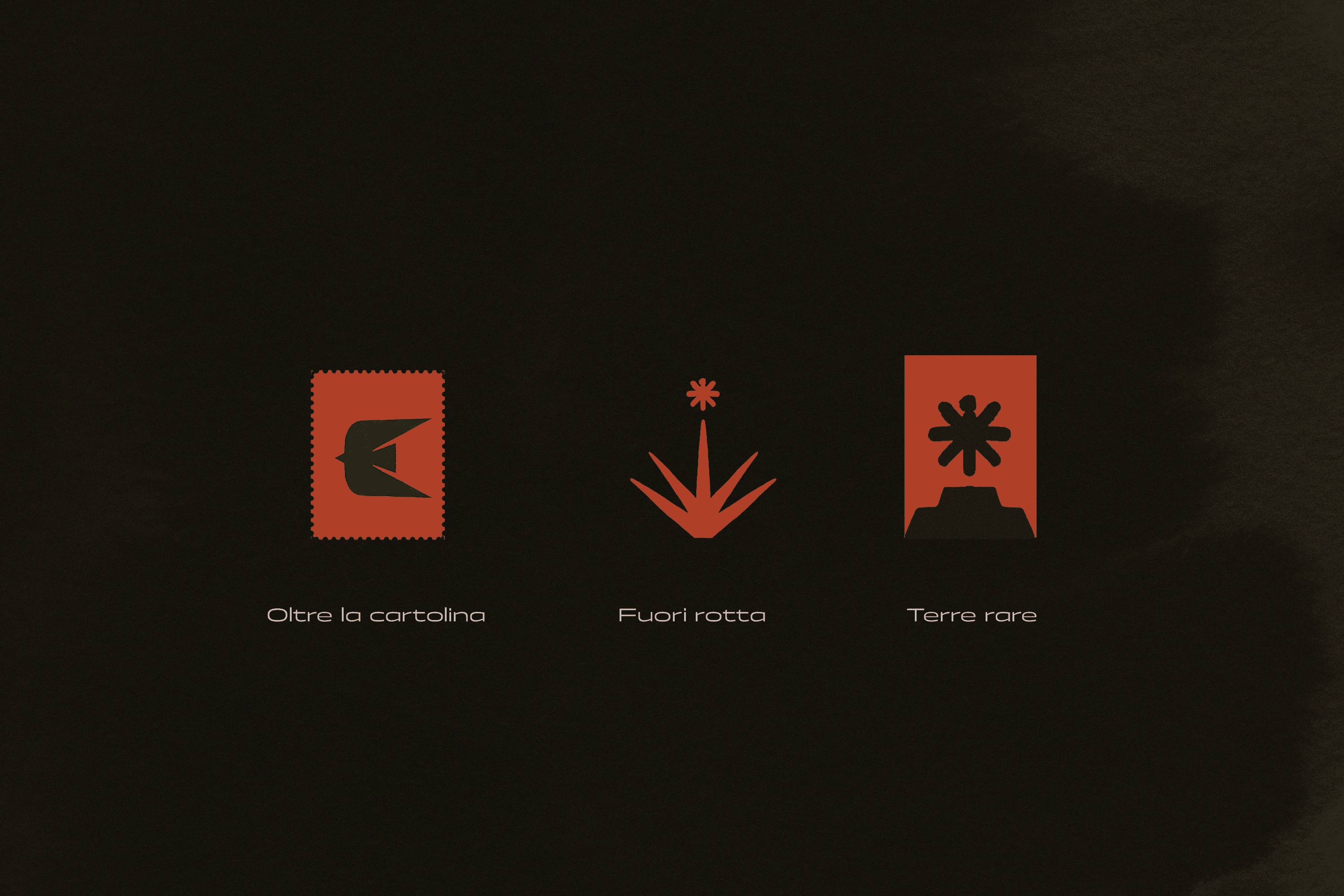
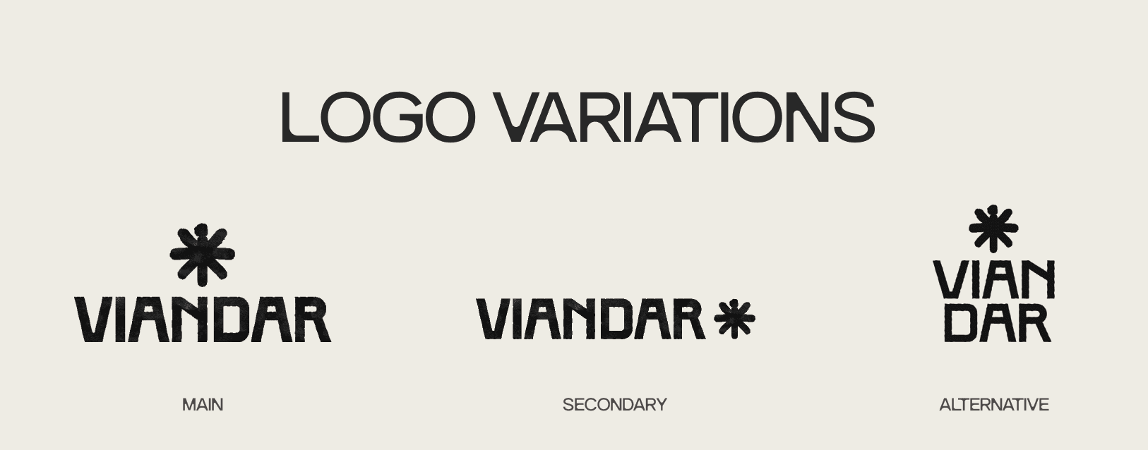
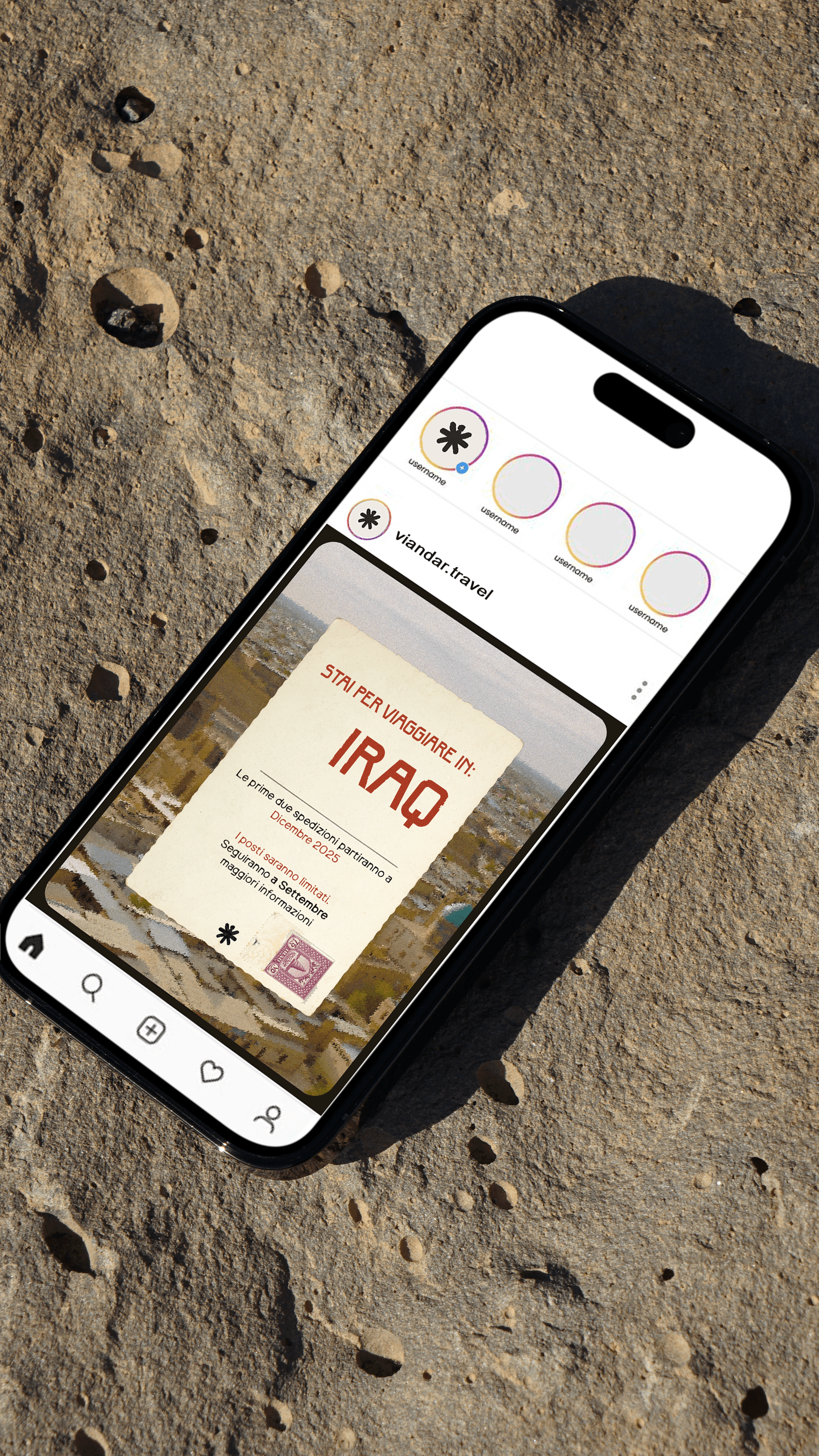
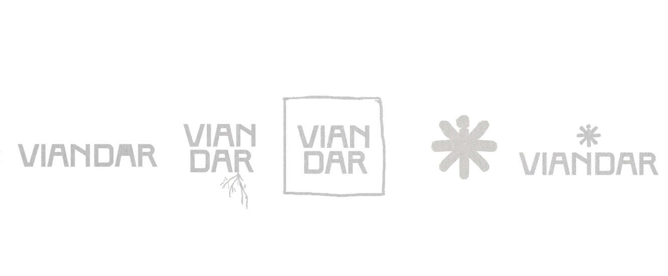
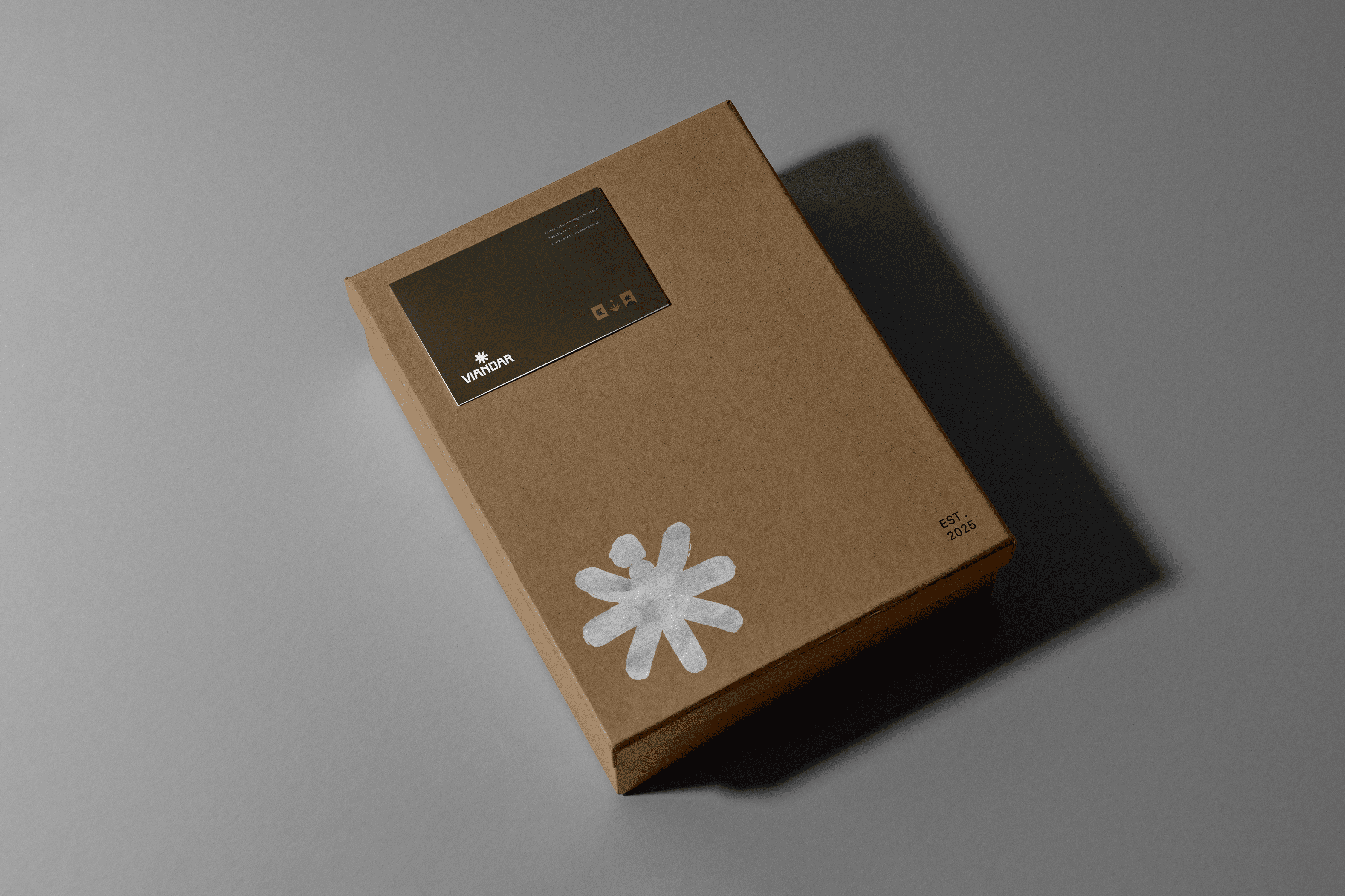
I created Viandar’s visual identity through a more organic and tactile design approach, shaped by the idea of travel as a human and sensory experience. The logo was designed by hand to reflect the warmth and irregularity of handmade souvenirs — objects that often carry the feeling of a place more authentically than something polished or industrial. This choice helped build a more intimate and recognisable identity, supported by irregular forms, tactile references, and a flexible visual system.